The paper texture lays the fiber of thick paper over the whole page. It takes the site out of the glass of the screen and sets it on a material: the page reads like a letter, an announcement card, a well-printed report. It is the texture of trades where the digital should go unnoticed: consulting, care, law, publishing.
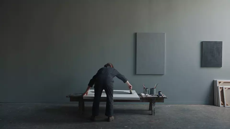 WithoutPaper
The demo uses a light poster, the wall of a painting workshop, because the texture works by darkening: an image that is already dark leaves it almost nothing to do. It shows fully on a light palette: cream, ivory, pale gray, sand.
Where the effect comes from
Paper is a material in thin sheets, made of fibers that bond together. Until the first half of the 19th century, these fibers came from rags; wood pulp replaced them afterwards, and the first mechanical pulp dates from 1860 (Larousse).
Made by hand, the sheet also keeps the trace of the mold that formed it. Laid paper bears the marks of its wires, the laid lines (Académie française), which appear as fine lines when you hold the sheet up to the light. Wove paper is formed on a very fine wire mesh, and looks woven when held to the light. In the West, James Whatman was probably the first to make it, and the Virgil printed by John Baskerville in 1757 is the first known book to use it (American Bookbinders Museum, 2015).
The studio’s library keeps its fiber, without laid lines or watermark: a gray, irregular noise, stretched in one direction, that evokes a thick, slightly rough paper. On a screen, it recalls what we associate with print: care, permanence, the document you sign.
When to use it
Five of the studio’s twenty-four ready-made layouts use it:
- the Health practice layout, for dentists, physiotherapists and doctors, who must reassure without talking down;
- the Consulting layout, for consultants, accountants and engineering firms;
- the Law firm layout, for lawyers, notaries and bailiffs;
- the Nonprofit layout, for clubs, NGOs and collectives;
- the Wellness layout, for yoga, massage and therapies, where it comes with a light leak.
All five have a still background, an image rather than a film: the page is looked at calmly, like a document. The paper texture also suits a publisher, a bookshop, a bookbinder, a stationer, an announcement-card designer, an architect showing their sketchbooks.
It is better left out:
- on a very dark palette. In multiply mode, the texture only darkens; on black, it has almost nothing left to do, and the library advises lowering its intensity;
- with grain: two textures fight over the same surface, and neither reads;
- with a neon glow: fiber and neon come from two worlds, and one makes you doubt the other;
- on a site that lives on the screen and speed: a software product, a 3D studio, a game developer. Paper looks like a disguise there.
The right dose
In the library, paper is set at 50% opacity, in multiply blend mode (multiply). Along with caustics, it is the highest default intensity of the set, and for a reason: the pattern is an irregular gray, itself half transparent, and multiply mode can only darken. A white layer changes nothing, a black layer turns everything black, a gray one darkens a little, like two images printed on transparent films laid on top of each other (MDN). On a light page, the fiber stands out clearly; on a dark page, it almost fades away.
The rule of two layers at most applies here as elsewhere: at the third, the image gets dirty, and nobody knows which one to remove anymore. In the Wellness layout, paper already shares the page with the light leak, and the two answer each other: the warm light brightens a corner, the paper gently darkens the rest.
What it costs
The pattern is a small SVG image 180 pixels square, written directly into the stylesheet: no file to download. The browser makes the noise from a filter, then repeats the tile across the whole page. It never changes, and nothing forces it to be redrawn while scrolling.
That is the condition for the layer to cost almost nothing. A browser only cheaply animates a layer’s position and opacity (web.dev); a full-screen texture that moved would force it to repaint the whole screen every frame. So the paper stays still. It only rises as you leave the first screen, to leave the welcome video or image intact.
Accessibility
- Contrast. The layer sits on top of everything, text included, and it darkens. Light text on a dark background loses a little brightness; a light background dulls under dark text. Check the contrast where the fiber is densest: at least 4.5 to 1 for body text, and 3 to 1 for a large heading (W3C, WCAG 2.2).
- Reduced motion. When the visitor asks their device for less animation (
prefers-reduced-motion), the library removes grain and frost. Paper stays: it is still. - No flashing. The layer doesn’t move and never flashes.
How it is made
The pattern comes from an SVG filter, feTurbulence, which makes Perlin noise, the kind used to imitate clouds or marble. It all lies in its frequency: the baseFrequency attribute accepts two numbers, the first for the horizontal, the second for the vertical (MDN). A very low frequency in width and a very high one in height stretch the noise into horizontal filaments, like the fibers of a sheet. A second filter, feColorMatrix, removes all color from it:
<filter id="f">
  <feTurbulence type="fractalNoise" baseFrequency=".035 .9" numOctaves="3"/>
  <feColorMatrix type="saturate" values="0"/>
</filter>
<rect width="100%" height="100%" filter="url(#f)" opacity=".55"/>
The drawing is written into the stylesheet as the background image of a layer laid over the page, which blends into the image in multiply mode. The opacity multiplies the layer’s setting by the “veil” that holds it back on the first screen:
.m.m--papier {
  mix-blend-mode: multiply;
  opacity: calc(var(--papier, .5) * var(--m-voile, 1));
  background-image: url("data:image/svg+xml;utf8,<svg …>…</svg>");
}
In the studio
The paper texture is one of the library’s ten textures. You choose it at the “The texture” step, after the background, alone or with a second texture.
Sources
- Larousse, Encyclopedia, “paper”
- Académie française, Dictionary, 9th edition, “vergé” (laid)
- American Bookbinders Museum, Marieka Kaye, A Brief History of Wove Paper (2015)
- MDN, feTurbulence
- MDN, the baseFrequency attribute
- MDN, feColorMatrix
- MDN, blend modes (blend-mode)
- web.dev, Stick to compositor-only properties and manage layer count
- W3C, WCAG 2.2, success criterion 1.4.3 “Contrast (Minimum)”