Nobody reads a restaurant’s website for fun. People come with a precise question, often from a phone, often an hour before the meal: is it open tonight, what do they serve, how much does it cost, can I book, how do I get there. A good site answers these questions in a few seconds, and makes people want to walk through the door.
What the customer comes looking for
In the United States, before trying a new restaurant, 85% of diners look at the menu online first, and 80% go to the restaurant’s website (TouchBistro, 2024). In France, 55% read reviews or recommendations before choosing (Ipsos bva, 2026). So people land on your site with an idea already: it must confirm it quickly.
The questions, in the order people ask them:
- The menu, with its prices. It is often what decides.
- The hours, closing days included, and special holiday hours.
- Booking, in one gesture: a button leading to your booking tool, or your number, tappable.
- The atmosphere: the dining room, the terrace, the light. Two or three honest photos are worth more than a slideshow.
- Getting there: the address, a link to the map, the nearest subway or parking.
Everything else, the history of the house, the chef’s philosophy, comes after, for those who already want to come.
The “Table” layout
This is the layout the studio offers restaurants, bistros and wine bars. Here it is from top to bottom:
“Table” layoutBackground: RevealTexture: Halation
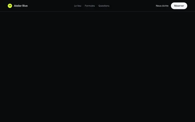 Floating pill
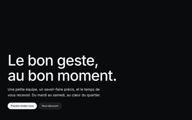 Hero · Bottom left
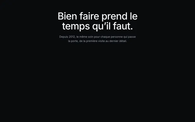 Statement
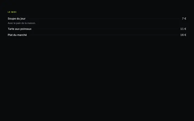 Menu · Two columns
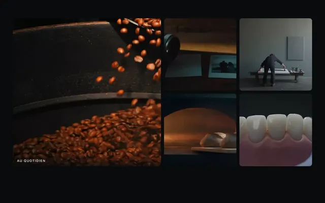 Gallery · Landscapes
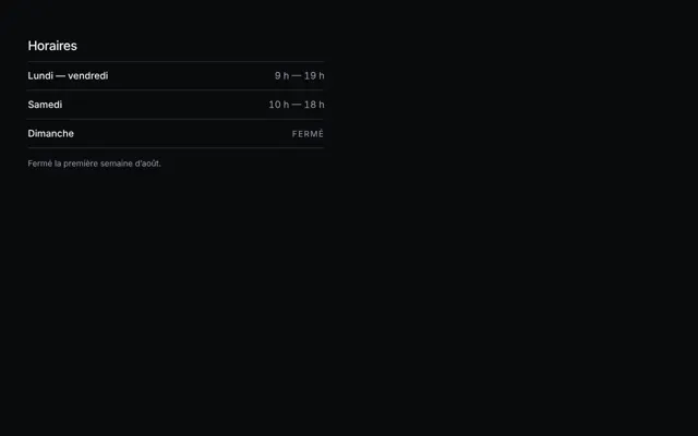 Opening hours
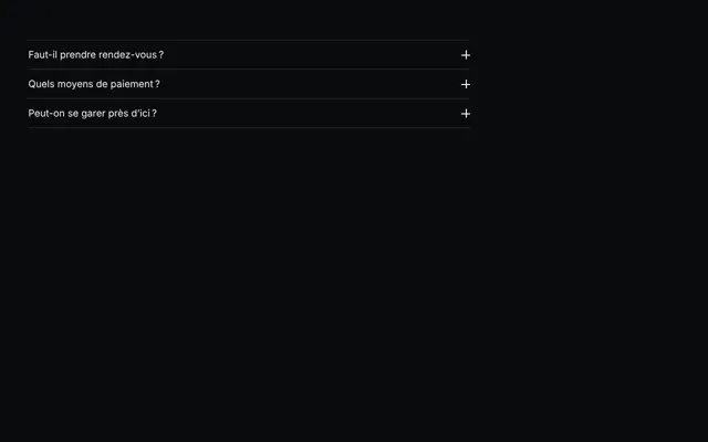 Accordion
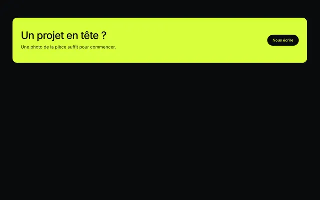 Call to action · Accented
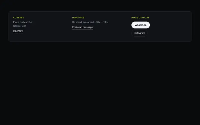 Contact · Panel
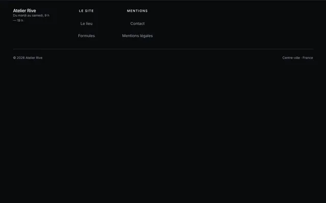 Footer · Giant signature
- The pill navigation floats above the video, detached from the edges: it stays discreet in front of the dining room and always within reach.
- The hero sets the name and a sentence at the bottom left, where the video leaves the most room. Its button leads to booking.
- The statement says in one sentence what sets you apart: the morning market, the wood fire, the cellar.
- The gallery shows the dining room and the plates in landscape format, the format of photos taken at the table.
- The numbered list carries the menu or its signature dishes, with their prices, in real text.
- The accordion answers the questions that keep coming back: allergens, groups, terrace, pets, private hire. Each question opens with one gesture.
- The contact brings together the address, the hours and the phone as real links: people call or open the map with one finger.
- The footer signs the page with your name.
The background chosen for this layout is the reveal: two stacked images, and the mouse pierces the top one, like opening a door a crack. Halation makes the light of the lamps spill over, as on film stock.
The menu in text, never as a PDF alone
PDF is made for printing. On a phone, you have to download it, zoom, scroll sideways: the Nielsen Norman Group, the reference in web usability, advises against it for anything read on screen. A photographed or scanned menu poses the same problem for people using a screen reader: accessibility rules (WCAG, criterion 1.4.5) call for text rather than an image of text.
Written into the page, the menu also serves your profile: Google can transcribe the menu from the business’s website to show it on its profile, and you keep control to correct or turn off that transcription. Keep the PDF, if you insist, for those who want to print it.
Update it at the same time as the chalkboard. A dish missing from the online menu, or a price that has changed, is a customer’s first disappointment before they even sit down.
The “Book” button
The studio doesn’t take bookings itself. The hero button and the navigation button lead wherever you want: your booking tool, your phone number, an email address. A single destination, the same everywhere, and the customer never has to look for how to book.
Put the same link in your Google profile: it accepts booking links, and you choose which one comes first.
The mistakes that cost covers
- Wrong hours, or different from one place to another: on the site, on the Google profile, on the door.
- A heavy page, slow to load on a phone network in the street.
- The number as an image, which can be neither tapped to call nor copied.
- Music that starts on its own, in an office or on public transport.
- Stock photos: the customer sees it, and wonders what you are hiding.
Sources
- TouchBistro, 2024 Diner Trends Report (United States, 1,500 diners, September 2023)
- Ipsos bva, The French and gastronomy (March 2026)
- Nielsen Norman Group, PDF: Still Unfit for Human Consumption (2020)
- W3C, WCAG 2.2, success criterion 1.4.5 “Images of Text”
- Google, Business Profile Help: menus
- Google, Business Profile Help: booking and ordering links