
A festival, a trade show, a party: an event’s website lives for a few months, and people check it under pressure. Before buying, they want to know who is coming, what it costs, and whether it is worth the trip. Then, on the day, often on a train or in a parking lot: what time the doors open, how to get in, what they are allowed to bring.
The visitor is in a hurry, sometimes anxious. The page must answer before they pick up the phone.
What the visitor comes looking for
- The date and the venue, from the first screen, with the year and the city.
- The lineup: the artists, speakers or exhibitors, and the times as soon as they are known.
- The tickets: the prices, what they include, and the button to the official box office.
- How to get there: the address, transport, parking, opening times.
- Accessibility: wheelchair access, reserved spaces, welcoming companions.
- The rules: the minimum age, forbidden items, no re-entry, cancellation.
The “Event” layout
This is the layout the studio offers festivals, trade shows and parties, those that fit in three words: a date, a venue, a box office. Here it is from top to bottom:
“Event” layoutBackground: SequenceTexture: Light leakTexture: Grain
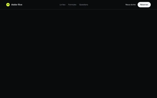 Floating pill
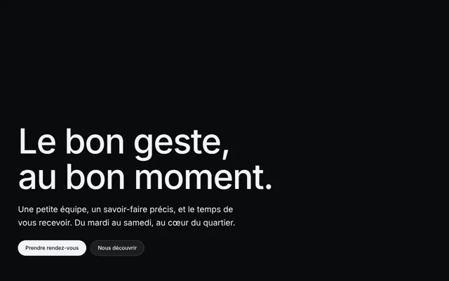 Hero · Bottom left
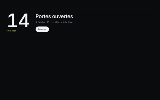 Event
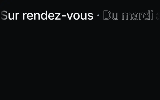 Banner
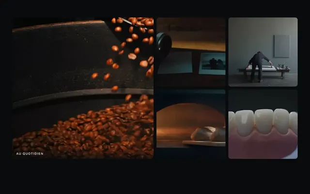 Gallery · Scrolling band
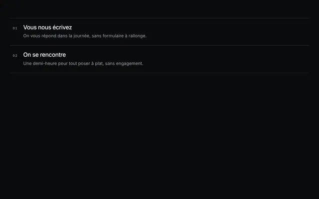 Numbered list
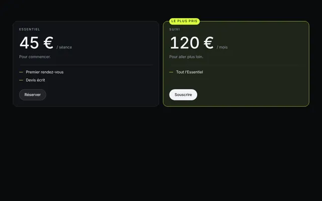 Pricing
 References · Scrolling
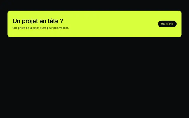 Call to action · Accented
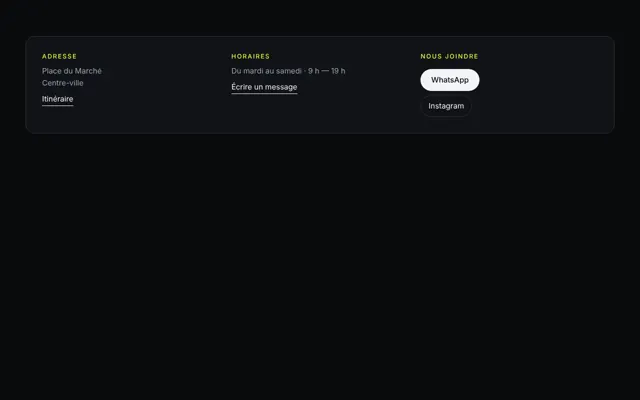 Contact
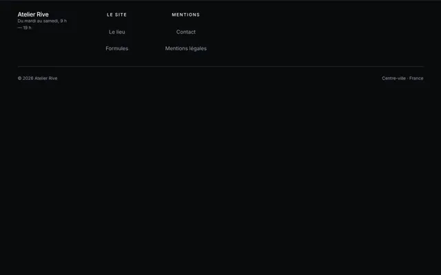 Footer · Giant signature
- The pill navigation floats above the video, detached from the edges: light, and always within reach to get to the tickets.
- The bottom-left hero sets the name, the date and the venue in the corner the video leaves free. Its button leads to the box office.
- The banner scrolls a strip of words: the names on the bill, as on a festival poster. Don’t trust it with the date or the times: scrolling text reads poorly.
- The scrolling strip gallery slides photos from the previous edition under a finger: the crowd, the stage, the venue.
- The numbered list carries the program day by day, or the practical information, in real text: people read it, copy it, a screen reader speaks it.
- The prices set the passes in equal columns, with what each includes: a day, the weekend, the reduced rate. Each column leads to the box office.
- The contact gives the organizer, their email, their phone and the venue address, as real links.
- The giant signature footer ends on the event’s name, cut off by the bottom of the page.
The background of this layout is the sequence: it changes scene as you scroll down: the site at dusk, then the crowd, then the night. Each scene is a shoot, so an extra cost, shown before launching, for an effect the visitor barely notices: two or three scenes are enough. The page also needs as many markers as scenes, otherwise the last sections keep the previous one. Two textures sit on it: the light leak, a warm flow coming in through a corner as on a badly closed film, and grain, the fine noise of film photography.
The button to the box office
The studio sells no tickets and collects nothing: it builds the page that makes people want to come. The hero button, the navigation button and the price buttons all lead to your box office, at the same address, with the same label: see the call-to-action button.
Three precautions:
- The same price everywhere. The DGCCRF points out that the price put forward doesn’t always include the service fees charged at checkout, and that these fees must be clearly announced (2026). Write on your page the price the buyer will pay, or say that fees are added.
- Cancellation terms, plainly. There is generally no right of withdrawal for a ticket, and terms of sale often provide neither exchange nor refund, the DGCCRF notes. Say what you do if the event is cancelled or postponed.
- “Sold out” when it is sold out. A button leading to an empty box office pushes people toward dubious resellers.
What the rules say: ticket resale
The DGCCRF sums up the French framework (2026). Occasional resale between individuals is allowed in principle, unless restricted: a named ticket, the terms of sale. Habitual resale without the organizer’s authorization, however, is forbidden, under penalty of a criminal fine, and the ban also targets whoever provides the means for this resale. For an event subsidized or supported by the state, the departments or the towns, resale is only possible at the original price at most.
Above all, it advises buyers to check whether the organizer has its own sales channel or recommends an official resale site. So it is up to your site to say so:
- Name your official box office, and it alone.
- Point to the official ticket exchange, if you offer one, for those who won’t be able to come.
- Warn that tickets bought elsewhere may be refused at the entrance, if they are named or already used.
Venue accessibility and practical info
In France, a building open to the public must keep a public accessibility register, which says what is provided so that disabled people can enjoy its services. It can be consulted at reception, and can also be found on the venue’s website (Entreprendre.service-public.gouv.fr, 2025). If you rent a hall, ask for theirs and put the essentials on your page: step-free access or not, reserved spaces, adapted toilets, welcoming guide dogs. The same page points to the public acceslibre platform, which lists the accessibility of places and which anyone can add to.
For the gallery photos, a crowd where no one is singled out doesn’t require individual consent, provided people’s dignity is respected and it doesn’t serve a commercial purpose; a face in close-up, however, does (Service-public.gouv.fr, 2022). For a page that sells admissions, the safest course is still to ask for the consent of recognizable people.
The mistakes that cost admissions
- The date missing from the first screen, or without the year.
- A dead box office link, or one leading to an unofficial reseller.
- Different prices between the page and the box office.
- The lineup only as a poster image, unreadable on a phone and silent for a screen reader.
- Not a word about accessibility.
- The past edition still online as if it were still to come.