A fine line every four pixels, across the whole page: it is the screen of an old monitor, the memory of a display where the image was drawn line after line. The effect is very strong. You choose it to evoke an era, a technical culture, a machine aesthetic; it is too visible to serve as a mere finish.
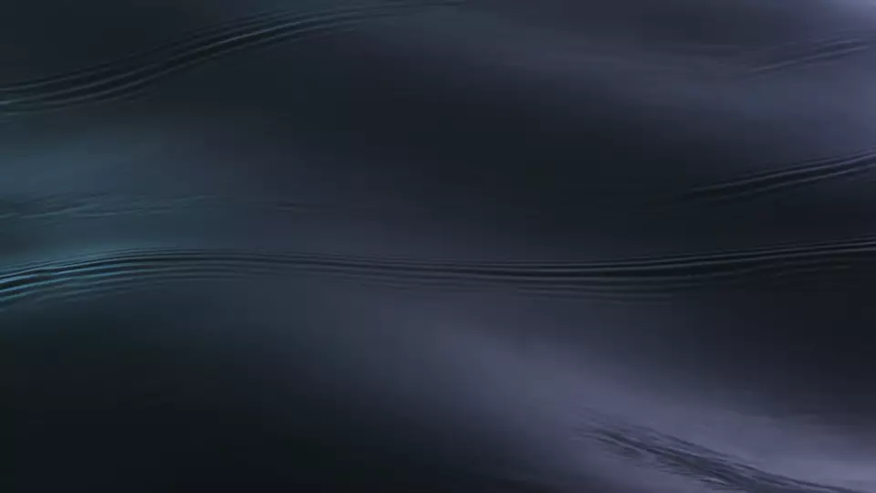 WithoutHalftone
Where the effect comes from
On a cathode-ray television, the image is never displayed all at once. It is scanned from left to right and top to bottom, one line after another. French analog television drew 625 lines per image, at fifty half-images per second, according to the International Telecommunication Union recommendation describing the world’s television systems. Before that, France had broadcast in 819 lines, the finest of the formats Britannica cites, with the so-called system E, which the recommendation lists as in use until 1984.
These half-images interlace. The first lays down every other line, leaving an empty space of the same width between them; the second comes to fill those spaces. They follow each other fast enough for the eye to see only one image (Britannica). Up close, though, the line structure stays visible, and that is what the layer imitates. For anyone who grew up in front of a tube screen, a few lines are enough to say “television”, “console”, “control-room monitor”.
When to use it
Scan lines tell of the screen and the machine. They suit:
- a creative studio working in computer-generated imagery or motion design, claiming a screen culture;
- a haulier or logistics platform, whose page reads like a dashboard;
- a factory or technical office, where precision and measurement come before decoration;
- an arcade, a sound studio, a retro-minded festival.
Three of the studio’s layouts apply them by default. The 3D studio layout pairs them with halation: a screen lit up in the dark. The Transport layout and the Industry layout carry them alone, on pages made of figures and capacities.
When to skip them. A health practice, a restaurant, a guesthouse: anything that must feel warm and human is better off without scan lines. Avoid them too on a page heavy with fine text, because a line every four pixels crosses every small letter. Finally, don’t combine them with halftone dots: two regular grids on top of each other can produce stray ripples, moiré.
The right dose
In the library, scan lines draw a one-pixel line every four pixels, in the site’s text color at 40%, and the whole layer is set at 18% opacity. On a dark page with light text, the lines are light; on a light page with dark text, they are dark. The lines thus stay within the palette.
Their spacing is fixed in screen pixels: it keeps the same fineness whatever the text size. The reason is written in the library’s stylesheet: lines that grew with the typography would lose their screen fineness and turn into a curtain.
Like the other textures, they leave the first screen bare and rise as you scroll down: the welcome video stays intact. And the library’s rule applies here as elsewhere: two layers at most. Beyond that, the image gets dirty, and nobody knows which one to remove anymore.
What they cost
Very little. The layer is a repeated gradient, drawn once by the browser, with no file to download, set in a fixed position.
It is still. Animated monitor effects, where a bright bar travels down the screen or the lines flicker, ask the browser to redraw a full-screen surface every frame; the library animates no layer. The only thing that varies is the lines’ opacity during the first scroll, and opacity changes without repainting the screen (web.dev).
Accessibility
- Contrast. The lines pass over the text as over the image. At the library’s dose, they weigh little, but they add to the background: measure the contrast of body text at the least favorable spot, at least 4.5 to 1 (WCAG 2.2, criterion 1.4.3), and reread the small print by eye.
- Reduced motion. When a visitor asks for less animation (
prefers-reduced-motion), grain and frost disappear. Scan lines stay, because they don’t move. - No flashing. The tube flickered at fifty half-images per second. The layer keeps its lines and leaves the flicker in the past: nothing in it flashes.
How they are made
A repeating linear gradient, repeating-linear-gradient(), running from top to bottom: one pixel of color, three transparent pixels, and the pattern starts again down to the bottom of the screen (MDN). The color is the site’s text color, mixed with transparency through color-mix().
.m.m--trame {
  opacity: calc(var(--trame, .18) * var(--m-voile, 1));
  background: repeating-linear-gradient(180deg,
    color-mix(in srgb, var(--fg) 40%, transparent) 0 1px,
    transparent 1px 4px);
}
--trame carries the intensity, --m-voile the rise of the layer after the first screen. On a high-density screen, one CSS pixel covers two or three physical pixels: the ratio between line and gap stays the same. On a screen scaled to 125% or 150%, some lines may look thicker than others; look at the page on your customers’ devices before publishing it.
In the studio
Scan lines are one of the library’s ten textures. You choose them at the “The texture” step, after the background.
Sources
- Britannica, Television: the scanning pattern (Donald G. Fink, updated 2026)
- International Telecommunication Union, Recommendation ITU-R BT.470-6: Conventional television systems (1998)
- MDN, repeating-linear-gradient()
- MDN, color-mix()
- web.dev, Stick to compositor-only properties and manage layer count (2015)
- W3C, WCAG 2.2, success criterion 1.4.3 “Contrast (Minimum)”