
A software website speaks to someone who already has a problem: quotes that drag on, a schedule on paper, forgotten reminders. They arrive skeptical, they have often tried other tools, and they look for three answers: does it solve my problem, do others really use it, how much does it cost. If they find them, they try it. Otherwise, they close the tab.
What the customer comes looking for
- The benefit, in one sentence: what the tool changes in their day, before the list of features.
- The product in action: real screenshots, a short video.
- The proof: named customers, signed testimonials, verifiable usage figures.
- The price: the plans, what each includes, before or including tax.
- The trial: how to start, and what to give to sign up.
- Trust: where their data goes, who is behind the tool, how to reach someone.
The Nielsen Norman Group, which studies the usability of business websites, insists on price: even between businesses, it should be displayed, and if it varies, show common cases, a starting price or a range. It also advises showing the product working, for those who can’t install anything without permission, and giving the job title and company of the author of each testimonial (2019).
The “Software” layout
This is the layout the studio offers online tools and business applications: the benefit, the proof, the price, in that order. Here it is from top to bottom:
“Software” layoutBackground: HaloTexture: Grid
 Full bar
 Hero · Centered
 Numbers · Counted
 Split · Media on the right
 Tabs · Pills
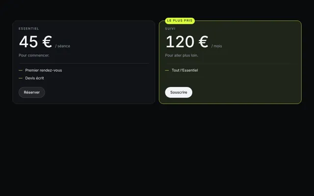 Pricing · Featured offer
 Table · Striped
 Testimonials
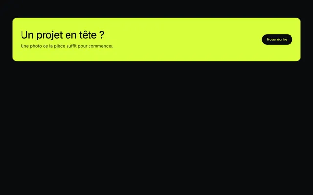 Call to action · Accented
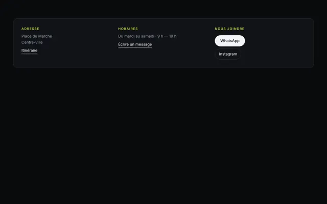 Contact
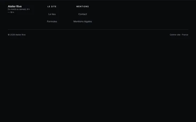 Footer · In columns
- The full bar has an opaque background: it reads from the first image, and the trial button stays visible there.
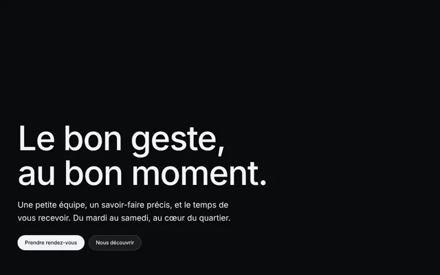
- The centered hero sets the benefit in one sentence, in the middle of the screen, the steadiest variant. Its button leads to the trial.
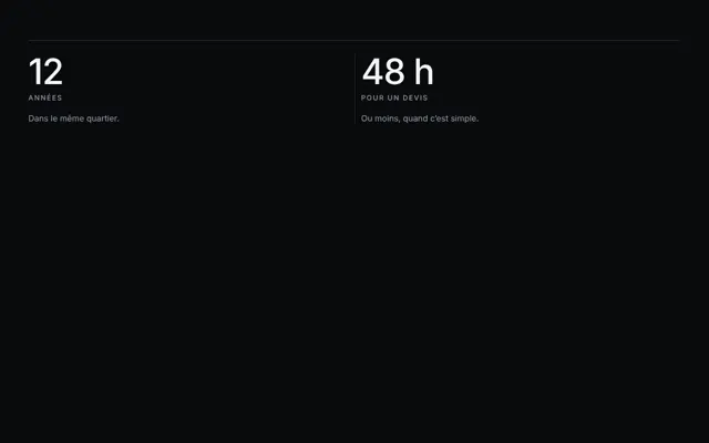
- The figures line up the row of proofs: customers, hours saved, documents processed. Only measured numbers, and dated.
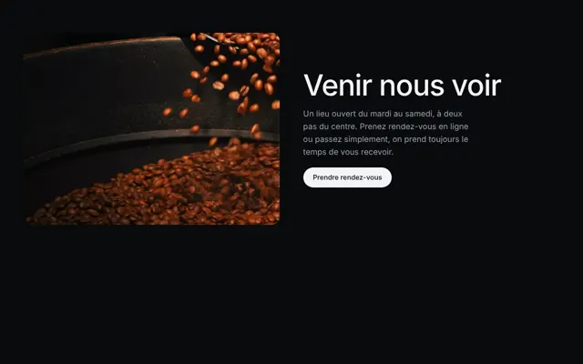
- The split, media on the right, puts a screenshot of the product on one side and the text on the other: a feature told through what it saves.
- The prices, featured offer, set the plans in equal columns, with what each includes. The recommended plan is marked by a rule and a label, never by enlarging its column.
- The testimonials bring together several reviews: a single one would read as the seller’s own claim.
- The contact gives the email and phone, for support as for sales, as real links.
- The columned footer holds what a buyer checks at the end: legal notice, privacy, terms and conditions, documentation.
The background of this layout is the hero video: it only exists on the first screen, then the background goes back to plain. It is the best balance between effect and risk, and the rest of the page, where people compare prices, keeps its speed and readability. If the visitor has asked for less animation, the video fades out and its poster stays. This film is a scene created by a video generation model from your description: it sets a mood, and your real screenshots go in the split. The texture is halftone, a grid of printing dots, made for technical directions where grain would look dirty.
The button to the trial
The studio builds the page that presents the tool and makes people want to try it. It manages neither your users’ accounts, nor their subscriptions, nor payment: the hero button, the bar button and the price buttons lead to your application, its sign-up page or your booking page for a demo. A single label, the same everywhere: “Try it”, for example, or “Request a demo”.
Say what the trial requires. The Nielsen Norman Group observes that nobody likes giving their bank card for a free trial, and advises limiting access by an email address. If your trial does without, write it under the button, with its duration and what happens at the end.
What the rules say: the GDPR, an argument for trust
When your customers entrust your tool with the data of their own customers or employees, you process it on their behalf: the GDPR then counts you among processors (article 4). Your customer remains the controller, and must only use processors who provide sufficient guarantees (article 28). An informed buyer will therefore come looking for them on your site.
Article 28 requires a written contract, setting out the subject, duration, nature and purpose of the processing, the types of data and the people concerned. The processor acts only on documented instructions, ensures confidentiality and security, helps its customer respond to people’s requests, deletes or returns the data at the end of the contract, and allows audits. It only uses another processor, a host for example, with its customer’s prior written authorization. In 2025 the CNIL penalized processors that didn’t meet their obligations, and points out that they must secure the data, process it only on instruction and delete it at the end of the relationship (review published in 2026).
What your site can show, plainly:
- Where the data is hosted, in which country, with whom.
- The list of your own processors, kept up to date.
- Your data processing agreement, downloadable even before signing up.
- How to retrieve your data and have it erased when leaving.
- A contact for personal data questions.
Not forgetting the privacy policy of the site itself, and its legal notice.
The mistakes that cost trials
- A hero that lists features instead of saying what you gain.
- “Contact us” as the only price.
- A bank card required before seeing the tool.
- Customer logos without their consent, anonymous or invented testimonials: see customer reviews on your site.
- Mockup screenshots that don’t look like the product people discover afterwards.
- Not a word about data: a buyer who has to ask for it by email goes elsewhere.